
Financial Case Studies
A client’s financial portal experience should
mimic the luxury of their lifestyle.
Bringing together a holistic experience for clients across investments, philanthropy, and tax.
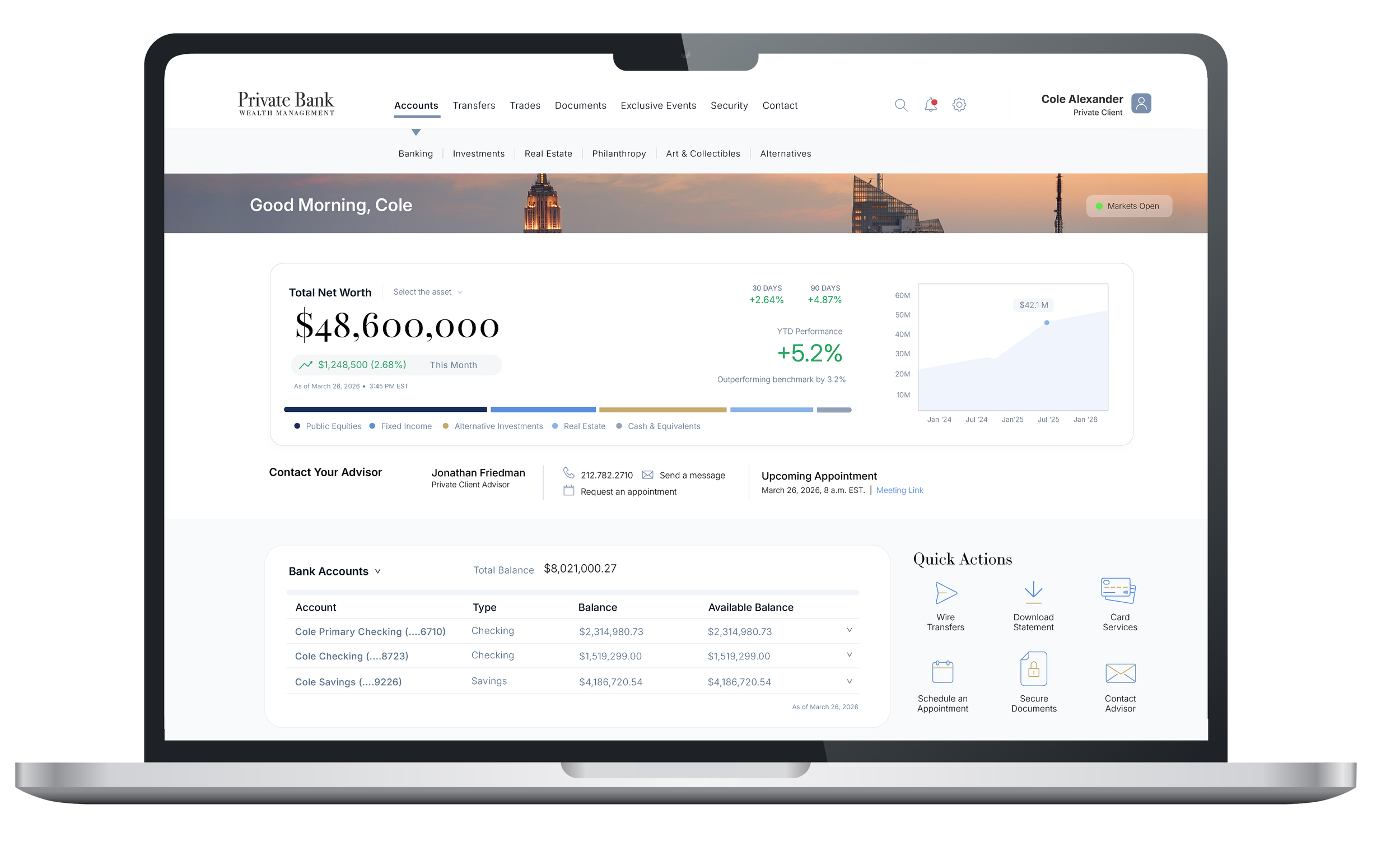
Financial Homepage
The Objective
The intent behind this experience was to redefine what “confidence” feels like in a UHNW digital environment. Rather than overwhelming clients with data density or performance theatrics, the design prioritizes clarity, composure, and control—the emotional fundamentals that matter most to ultra-high-net-worth individuals managing complex financial lives.
This interface was designed to behave less like a financial dashboard and more like a trusted private advisor: anticipatory, calm, and precise. Every interaction reinforces the sense that the client’s wealth is not merely tracked, but architected and stewarded with intention.
Elevated Design Approach: From Performance to Perspective
Rather than centering the experience on short-term market movement, the design establishes a long-horizon mindset. Primary emphasis is placed on total net worth, structural allocation, and portfolio health—allowing performance metrics to exist as context, not noise.
Typography as a Signal of Confidence
Typography is used as a primary tool for hierarchy and tone, not decoration. Large, composed numerals establish financial gravity without exaggeration, while secondary text remains intentionally understated. This typographic restraint avoids urgency or speculation—two emotions UHNW clients actively reject.
A limited typographic palette ensures consistency across sections, allowing the user to intuitively understand relative importance at a glance. Weight, size, and spacing do the work of emphasis, eliminating the need for excessive color or iconography.
This approach reinforces credibility and aligns with the visual language of institutional trust.
Color Palette Intent, Accessibility & Compliance
Color is deployed with precision and discipline. The palette favors neutral foundations, allowing the content—not the interface—to command attention. Accent colors are reserved exclusively for meaningful state changes, such as performance direction, ensuring they remain informative rather than distracting.
This restrained use of color minimizes emotional volatility and reinforces a sense of steadiness, even during periods of market movement. The interface communicates that fluctuations are expected, measured, and managed—never alarming.
The overall effect is emotional regulation through design, a critical requirement for wealth at scale. Plus, attention to Accessibility standards and compliance regulations.
Part 2 of the Homepage
Highlights
Holistic networth
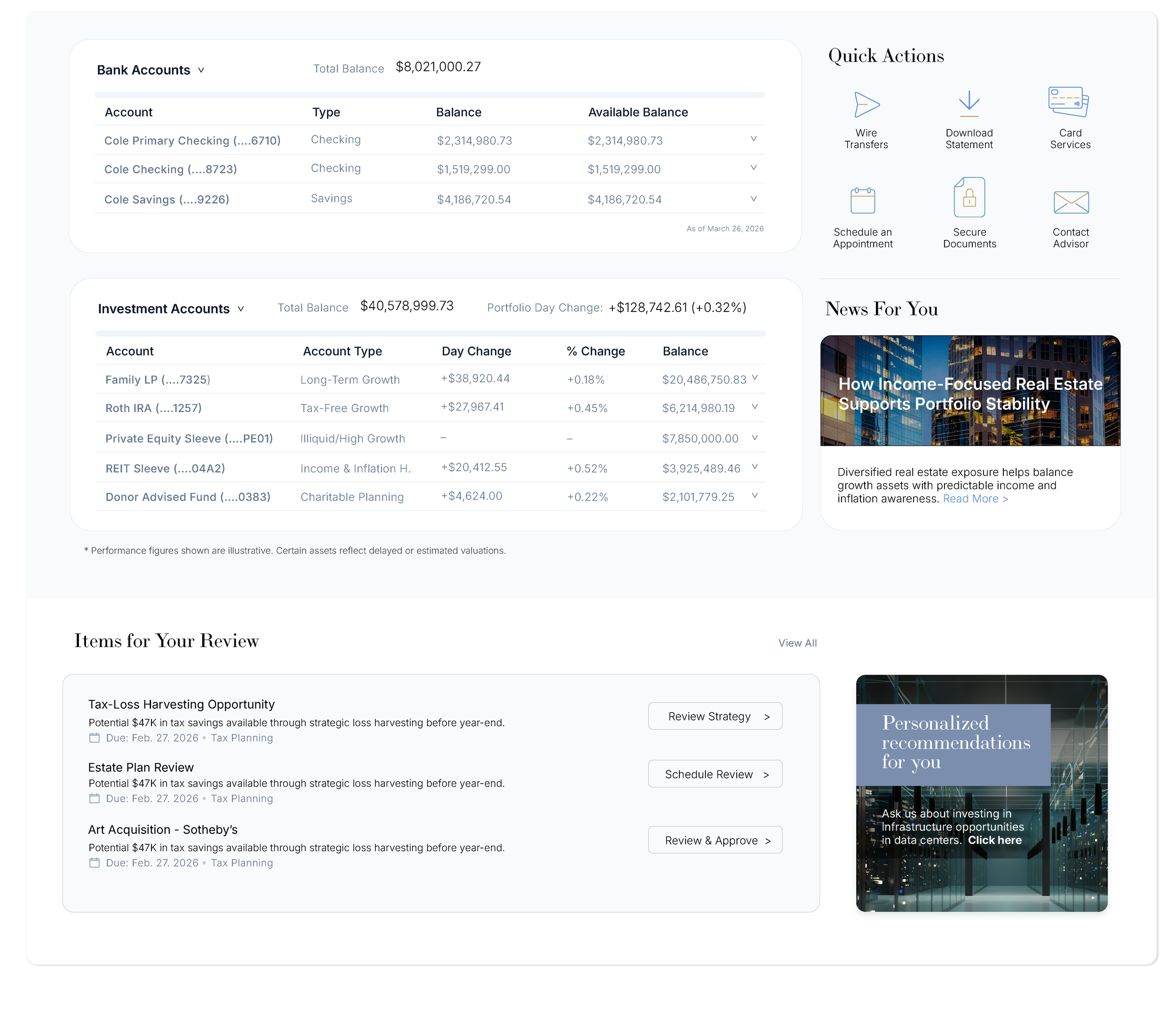
Quick actions to get in touch with an advisor, placement based on eye-tracking research for best practices for visibility of important content. Since that advisor-client connection is crucial in UHNW financial relationships.
Important information is immediately accessible
Visual hierarchy replaces explanation
Color and motion reduce emotional noise
Typography conveys authority without arrogance
The system scales across complexity without feeling heavy
Seamless Integration of Human and Digital
The interface is intentionally designed to complement—not replace—the human advisory relationship. Clear pathways to insights, planning, and next steps are surfaced without urgency, reinforcing the sense that the client is supported by both technology and expertise working in concert.
Click to expand
Hierarchy as a Trust Mechanism
Information hierarchy was treated as a core trust signal. Large, calm typography anchors total value, while secondary metrics recede naturally, reducing cognitive load. This hierarchy mirrors an in-person private banking conversation—where the advisor leads with clarity, not detail, and drills down only when invited. White space is used deliberately to convey restraint, confidence, and discretion. Nothing competes for attention unnecessarily.
Modular Sections
Modular sections allow the experience to scale without visual clutter, while consistent column alignment and rhythm reinforce predictability and trust.
Precision Without Anxiety
Market data, day change indicators, and trend visuals are presented with measured restraint. Motion and color are intentionally subdued to avoid emotional spikes. The goal is not to excite, but to reassure—signaling that volatility is expected, understood, and managed. This approach respects the emotional reality of wealth at scale, where unnecessary alarm erodes trust.
Part 3 of the homepage
Attention to Detail
Subtle touches like elevated iconography and visual elements make the space warmer and more inviting, making it feel less like a clinical financial space.
Important key financial information
Relevant tailored content related to their accounts for a customized environment
Quick actions through visual iconography (as we know client respond more effectively to actions through visuals)
Easy review of important financials, where the system works as an aid
Where Wealth Becomes Access
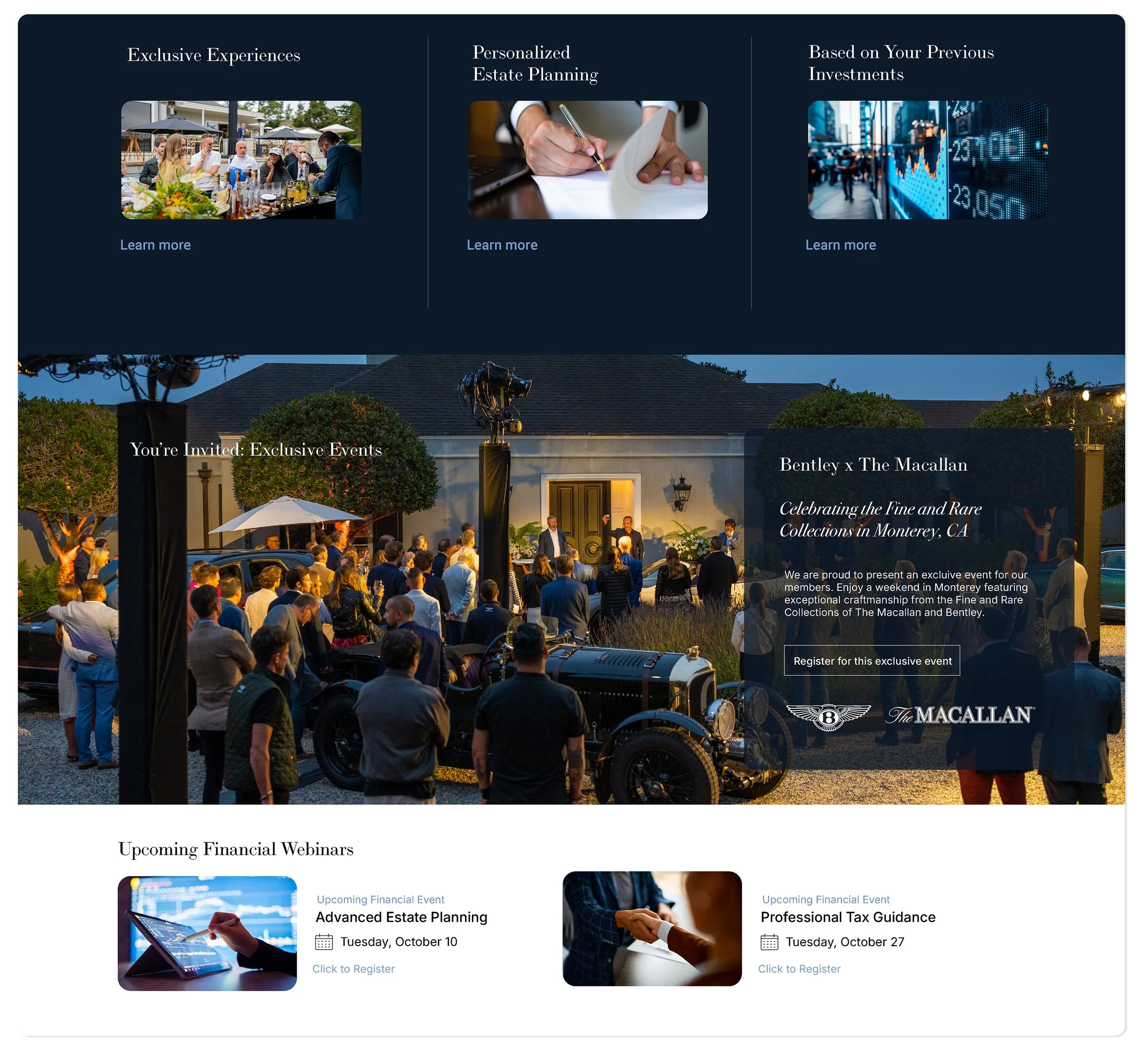
This section positions the institution not as a service provider, but as a trusted curator of access, insight, and opportunity. The experience moves beyond transactional finance into relationship-led value, signaling that membership unlocks moments, expertise, and experiences not available through conventional channels. Rather than promoting products, the design emphasizes belonging—subtly reinforcing that the client is part of an informed, selective circle where value is delivered through relevance and discretion.
From Services to Privilege
The content is framed around what clients are invited into, not what they are sold. Language such as “Exclusive Experiences,” “You’re Invited,” and event-led storytelling shifts the relationship from utility to privilege. This reframes wealth management as access to curated opportunities, aligning with UHNW expectations where differentiation is defined by what is available to them.
Intelligence-Led Personalization
The framing “Based on Your Previous Investments” subtly communicates capability without exposition. It reassures the client that the institution understands their financial history and uses that insight to deliver relevance—not volume. Personalization is implied, not explained, an important signal of maturity.
Brand as Connector, Not Centerpiece
While partner brands (Bentley, The Macallan) are visible, they are presented as shared values, not endorsements. The institution remains the connector and steward of experience, reinforcing its role as a long-term relationship manager rather than a marketer.
Editorial, Not Promotional
The layout and copy adopt an editorial tone that is calm, composed, and confident. There is no urgency, pricing pressure, or conversion-heavy language. Calls to action (“Learn more,” “Register”) are intentionally understated, reinforcing that participation is optional and selective. This restraint builds credibility and mirrors the way UHNW relationships operate in the real world.
Outcome
The result is a digital experience that feels quietly powerful—one that communicates stability, foresight, and discretion at every level. It avoids the visual language of trading platforms and consumer finance tools, instead aligning with the expectations of private banking, family office, and legacy wealth management. This design earns trust through restraint, clarity, and intentionality.
Clear Hierarchy Builds Immediate Trust
The layout establishes confidence from the first glance. High-level impact metrics—available funds, tax efficiency, volatility, and lifetime giving—are surfaced immediately and grouped cleanly. This allows the client to understand where they stand before engaging with detail.
Importantly, these metrics are presented with restraint. The numbers feel informative, not performative. This reinforces that philanthropy here is measured, thoughtful, and governed.
Balance Between Strategy and Humanity
The design intentionally balances analytical rigor with human impact. Data-driven components (goals, category breakdowns, tax benefits) are paired with real-world outcomes (recent grants, recommended charities). This duality is critical—clients can see both how their capital is working and who it is helping, without one overshadowing the other.
The result is an experience that feels grounded and authentic rather than idealized.
It also features recommendations based on the clients past charitable actions.
Editorial Framing Builds Authority and Trust
In an effort to encourage engagement with the portal as a trusted hub, the content is tailored to the client’s financial decisions and interests, as editorial insight, not alerts or updates, which signals credibility and maturity. Research consistently shows that UHNW audiences respond more positively to interpretive guidance than to raw information or frequent updates. So then the design approach was presenting the insights as interpretation, not notifications.
Personalization Without Exposure
Tailored news is surfaced subtly, without explicit explanation of how personalization occurs. This is a critical design decision. UHNW clients value relevance, but are highly sensitive to over-personalization or data exposure.
By curating content that clearly aligns with the client’s financial profile—without calling attention to the mechanics—the design reinforces intelligence and discretion simultaneously. The experience feels considered, not surveilled.
Calm Information Density Supports Decision Quality
The layout intentionally limits the number of stories and uses generous spacing, allowing each piece to carry weight. Research in decision science shows that reduced choice sets improve comprehension and confidence, especially for complex topics.
Rather than overwhelming the client with market noise, the experience offers a small number of high-quality signals, reinforcing that what is presented has already been filtered through expertise, further supporting a humanized approach to content personalization.
Tailored Events
Another important feature is including relevant tailored seminars, events and more for an exclusive supportive feel.
Elevated Mobile Design Approach
Research in high-net-worth behavior shows that mobile usage skews toward monitoring, not execution. This design respects that mental mode.
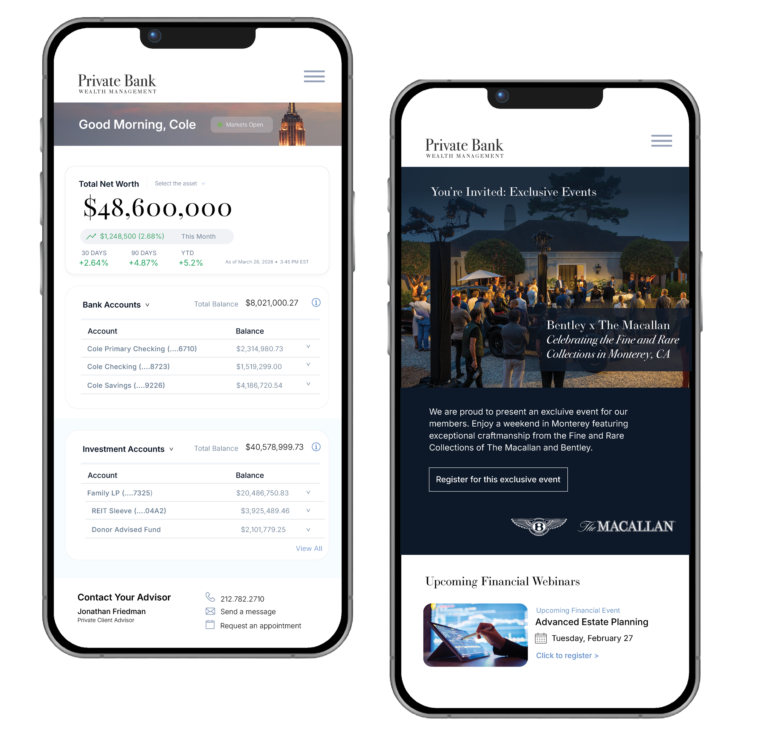
This mobile experience is designed not as a compressed version of desktop, but as a distinct, high-confidence touchpoint for UHNW clients one that prioritizes reassurance, orientation, and continuity over interaction density. A user-friendly, quick touch-point, for this audience that is often traveling is meant to streamline the important information effectively. At this level, mobile is not a place for deep analysis. It is a place for confirmation, awareness, and connection. Every design decision reflects that reality.
Why This Mobile Approach Resonates at the UHNW Level
It respects limited attention without reducing sophistication
It prioritizes emotional reassurance over interaction density
It reinforces continuity with the broader private banking relationship
It feels composed, intentional, and governed
Mobile as a Confidence Check, Not a Control Center
Total net worth is surfaced immediately, supported by restrained performance indicators. This establishes calm orientation without encouraging reactive behavior. The experience reassures before it informs.
Visual Restraint Signals Discretion
Color and imagery are used sparingly and purposefully. Accent colors signal positive movement, not excitement. Imagery is atmospheric and editorial, reinforcing context rather than prompting action. This restraint signals discretion, an essential trust marker for UHNW clients who equate visual excess with instability.
Events and Insights Framed as Invitations, Not Content
Editorial content and events are framed as invitations, not feeds. This reinforces exclusivity and relevance without urgency. The mobile experience suggests presence and opportunity, not obligation. By limiting volume and elevating tone, the platform avoids the common pitfall of turning insight into noise.
Human Access Is Always Visible
Advisor access is consistently present and frictionless. Phone, message, and appointment options are clear and immediate, reinforcing that mobile is not a replacement for human guidance—it is a bridge to it. This subtly communicates that technology supports the relationship, not the other way around.